From Desert to Design—Sculpting Light and Shadow
About
Industry
Interior Design
Founded
2016
Founders
Gema Gutiérrez
Headquarters
Madrid · Milan · Marbella
Interweaving Textures and Traditions in Bold Design
Raised amid the deep contrasts of Almería, from arid deserts to the mesmerizing Mediterranean, designer Gema Gutiérrez infuses her heritage into every creation. Her designs blend natural stone with glass, and weave bold metals into rich fabrics, capturing not only the interplay of light and shadow but also a profound connection to diverse cultural traditions.
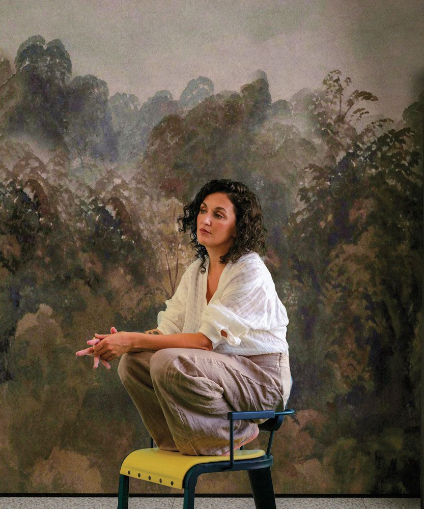
Almería is your homeland and also a place rich in colors, vistas, and a dense cultural history. How do you believe these elements from your land intertwine with the dimensions of your design? Is there any distinctive feature of Almería that you consider a signature in your work?
Almería, the place where I grew up, continually inspires my design work. The stark colors of its desert landscapes and the Mediterranean’s deep blue are echoed in my color palette. The region’s rich history of diverse civilizations in coexistence has inspired me to seamlessly blend styles and textures.
A standout feature of Almería that influences my work is the natural brightness of the surroundings, which compels me to design spaces that naturally enhance both light and shadow.
Where do you think your design sensitivity comes from? Was there an early experience you consider pivotal in this regard?
My appreciation for design developed from my childhood visits to historic buildings with my family. Each exhibit and monument taught me to appreciate shapes, spaces, and colors, profoundly shaping my aesthetic perspective from a young age.
When starting a project, do you have any rituals that help you connect with the space and begin the creative process? How do you prepare mentally and emotionally for transforming a space?
Before I dive into a project, I prefer to spend some time alone, away from any visual or informational clutter, tuning into the sounds, colors, and shadows around me. In our fast-paced, overstimulated world, our brains often resort to surface- level thinking when overwhelmed with the constant demand to process information and make quick decisions. This can hinder deep, focused work, which requires extended periods of undistracted concentration. My ritual involves connecting with the space to envision its transformation potential. Part of my mental and emotional preparation includes meditation and drafting preliminary sketches.
Are there particular materials or elements you’re drawn to or consider essential for “editing” a space? How do these preferences influence the character and atmosphere of your designs?
I’m particularly drawn to mixing materials. These elements do more than just add color and texture; they are crucial for creating a space that feels warm, authentic, and soulful. The unique personality of natural stone, the bold presence of metal, the delicacy of glass, and the blend of textiles are staples in my work. My goal is to harmonize these without compromising the essence and prominence of each material individually. These choices give my designs their bold and contemporary character.
Puntofilipino projects are known for their distinctive use of textures and colors. What value do these choices add to your projects, and how did your affinity for incorporating these elements into your designs originate?
I believe textures and colors bring a rich, multidimensional quality to my work, adding both depth and character. My fascination with these elements began during my design education, where I explored their ability to dramatically alter spatial and emotional perceptions.
How do you assess the interplay of natural and artificial light in your projects, and how does it influence your other aesthetic choices?
Light plays a pivotal role in my designs. I use natural light to bring out the best in materials and forms, while artificial lighting is chosen to create distinct moods and accentuate architectural elements. This careful consideration of lighting is a key factor in my aesthetic decisions and shapes the overall design process.
In such a competitive and saturated field like interior design, how do you keep your work fresh and innovative? What are your main sources of current inspiration?
To keep my work fresh and innovative, I continuously seek inspiration from fashion, art, music, and architecture. Traveling and exploring new cultures also fuels my creativity, allowing me to incorporate fresh ideas into my designs. I tend to keep mainstream aesthetic trends at arm’s length; I observe and respect them, but my creations uniquely arise by seeking the essence and soul through materials and objects.
Has there been any book, movie, or personal encounter that radically changed your understanding of the world and, consequently, your approach to design?
Well, an experience that really transformed my perspective was the encounter with the Japanese designer, Issey Miyake. His design approach, blending technology and tradition, made me rethink how spaces can adapt to modern life without losing their historical andcultural essence.
We know that behind the story of every brand lies something interesting. Can you tell us how the name Puntofilipino came about?
The name “Puntofilipino” stems from an episode involving Fabio de Miguel, known artistically as Fabio McNamara. The anecdote goes that, after a romantic breakup, a neighbor of McNamara’s painted his living room with vibrant and striking colors. McNamara, upon seeing the room from outside, was so impressed that he asked to see it up close, exclaiming about the striking “Filipino point” he had observed. This expression, “Filipino point,” is associated with something mischievous, daring, and visually scandalous, capturing the essence of the studio that aims to stand out with bold and distinctive design. This story illustrates how the name encapsulates the studio’s philosophy of going beyond the conventional, using design to express a unique and daring identity.—
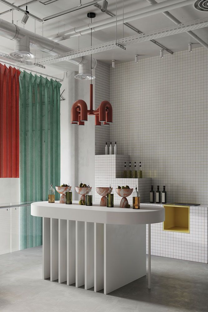
1. Espacio Lladró, 2023
Client: Lladró
Espacio Lladró at DecoHub.io in Spain combines nostalgia and futurism with primary colors, muted tones, and high-gloss woods, marble, and microcement.
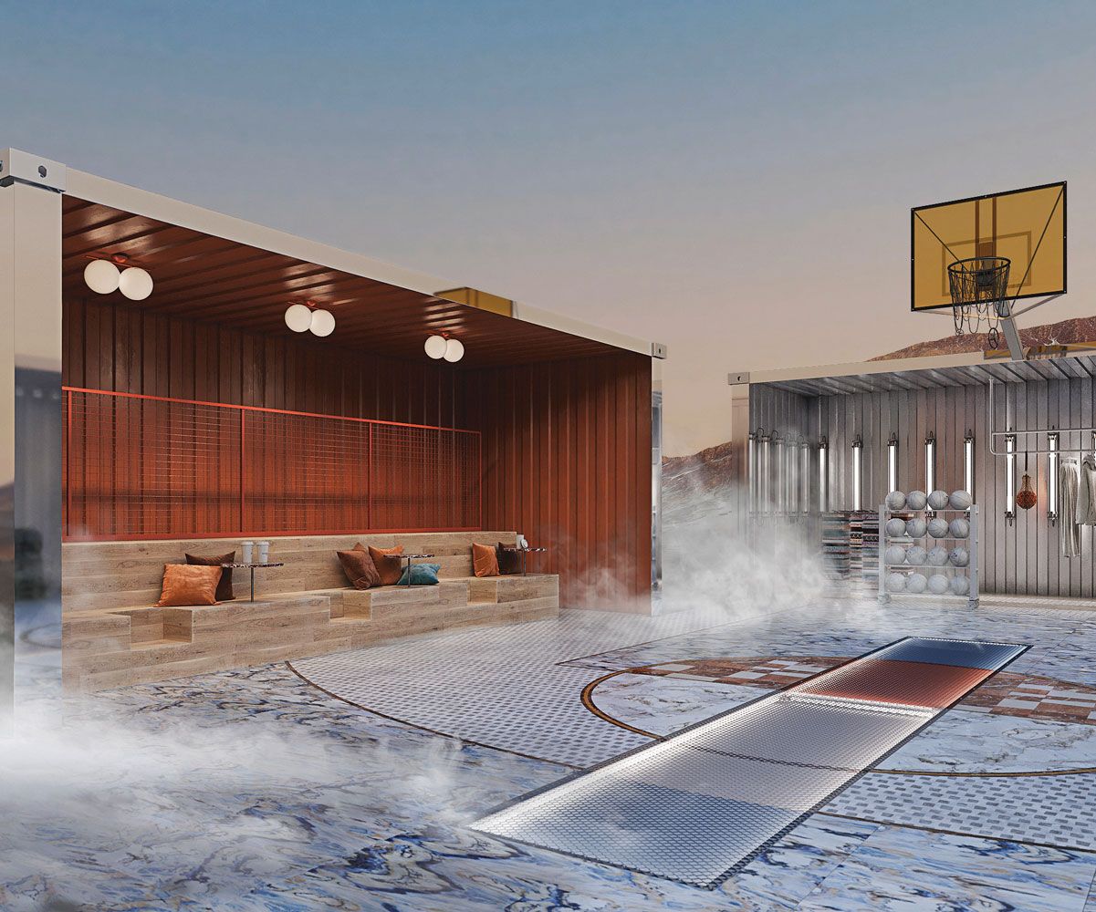
2. Basket Container, 2021
Client: Private. Metaverso
The project channels Bauhaus sensibilities with a cubic complex featuring architectural simplicity, rigorous geometry, and industrial materiality. Minimalist interiors transform the structure, centering on desert views.
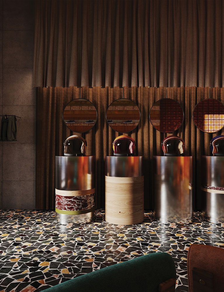
3. Volgare Store Milán, 2022
Client: Volgare
Volgare’s interiors draw from Milan’s creative scene and Mexican, Moroccan, Spanish, and Portuguese design. It blends organic tones and textures, evoking Amalfi coast lifestyle.
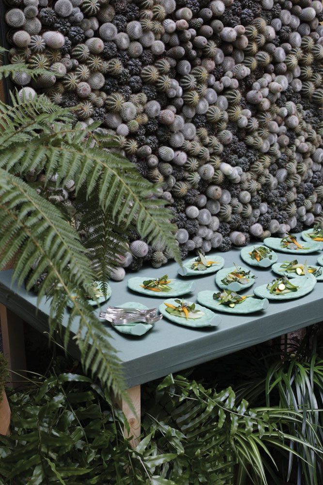
4. Hermès · La Nature au Galop, 2016
Client: Hermès
Spectacular nature-inspired space, exploring Hermès’ metal craft. Filled with vegetation, three landscape-themed tables offered fresh local fare.
5. Altelier Granada, 2021
Client: Caviar de Riofrío
Focused retail space with vibrant products. Neutral palette of white, yellow, and muted blue-green allows colorful goods to shine. Handmade resin flooring, mosaic, stone, and lacquered metal create harmony.